Exploring the US Opportunity Atlas
wb_incandescentNote card diagnostic
Administered during class on Monday, 5-Nov-18. This card asks students to consider a survey data project targeted in Pittsburgh's Hazelwood neighborhood. Respondents are asked to assess the degree to which the survey's findings can be generalized to a the larger neighborhood population.
bookExternal Resources
- American Factfinder
 (The primary data portal for the US Census programs)
 - Assembling ACS summary file info in spreadsheets (Advanced topics)
- Role of the ACS in determining federal spending: Report by Bookings Institute (2010)
- Opportunity Atlas interactive map
- Opportunity Atlas raw data download page
- Why do folks fight so much about the US Census?
Atlas-data-based visualization at NYT
Thanks to Mr. C. M. Darsow, the following static image is a link to this New York Times schnazzy visualization of the same data from which the Atlas map is derived.

arrow_upward back up to contents
check_boxLearning Objectives
- Navigate the US Census Bureau's website to access pre-packaged and raw census data from its various programs
- Differentiate between the US Decennial census and the American Community Survey (ACS) with regard to program goals and data collection methods
- Interpret simple ACS statics taking into account the standard errors of the measurements
arrow_upward back up to contents
webGet the student worksheet
Download the open document text (*.odt) version or the portable document (*.pdf) version of the companion worksheet for this module. Stop and work through the questions in this document as prompted in the exercises.
arrow_upward back up to contents
motorcycleExposure activity 0: ACS Tables
Exercise type: Data exploration
- Navigate to factfinder.census.gov
- Click "advanced search"
- Under topics, choose people >> employment >> Occupation
- Under geographies, choose all County (050), then PA, then add Allegheny County, PA and St. Francis County, AR
- We want to work with the Table ID B24011 (Occupancy by median earnings).
- Comparing the earliest years on record, which counties show the most growth? In which occupations?
Upload your work products:
Census and Atlas upload location
arrow_upward back up to contents
extensionExercise 1: Orienting yourself to the Opportunity Atlas
Time Estimate: 45 - 60 Minutes
This exercise will walk you through comprehending the essential features of the Opportunity Atlas. The creators of The Atlas have compiled some nifty guided page-tours and traditional PDF documentation to help users access the data. You're invited to dedicate about an hour to this introductory exercise.
Part 1: Explore the full tutorial
- Right click this link and select something like "Open link in new Window" to open the Opportunity Atlas. This will allow you to easily toggle between this guide and the tool itself.
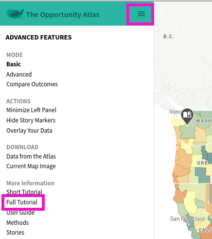
- As soon as The Atlas loads, click the little hamburger menu icon in the green bar in the upper left.
- With the meu pulled up, click "Full Tutorial" and carefully work through each ofthe guided steps. See the screen clip below.
Part 2: Read the PDF user guide (6 short pages)
Open The Atlas user guide in a new tab with this link. Each of the key features of The Atlas is explained in greater detail than the on-screen tour.
Part 3: Read about the tool's data methodology (4 pages)
Like many of the data products put out by the US Census, The Atlas is backed by rigorous statistical methodology. Since this is a data analytics course designed to build your quantitative reasoning skills, devote at least a half hour to reading and thinking about the Atlas methodology in this 4-page PDF.
Part 4: Read the FAQ
The authors assembled a very informative questions-and-answers page, which you should read carefully.
Part 5: Brush up on percentiles
The Atlas makes extensive use of percentiles to compare individuals. If you're not already intuitively familiar with percentile ranking, please review this nice and easy mathisfun.com tutorial on percentiles questions-and-answers page, which you should read carefully.
Part 6: Respond to Exercise 1 true/false items in the companion worksheet.
If you haven't already done so, get setup with the companion worksheet for this module and respond to the questions in the Exercise 1 section.
arrow_upward back up to contents
extensionExercise 2: Detecting patterns in The Atlas data
Estimated time: 1 hour
Now that you're familiar with how The Atlas works, you're ready to detect and analyze trends in the data related to social mobility. Let's make sure you have in your head the essential relationships The Atlas is designed to illuminate:
Social Mobility |
The Atlas is designed to graphically show connections between the circumstances of a person's childhood--most importantly, the income of one's parents--and that same person's life situation as an adult. Social mobility refers to children who are categorized as higher on the "social ladder" than their parents were. Since there are lots of folks in the USA whose grow up in less-than-desirable circumstances, looking for patterns related to who exceeds their parents life status is a meaningful endeavor. |
The following exercise sequence guides you through viewing the case studies embedded in The Atlas and then finding your own instances of the same patterns identified by the professional statisticians at Harvard and the US Census Bureau.
Phase 1: Study the geography of opportunity in LA
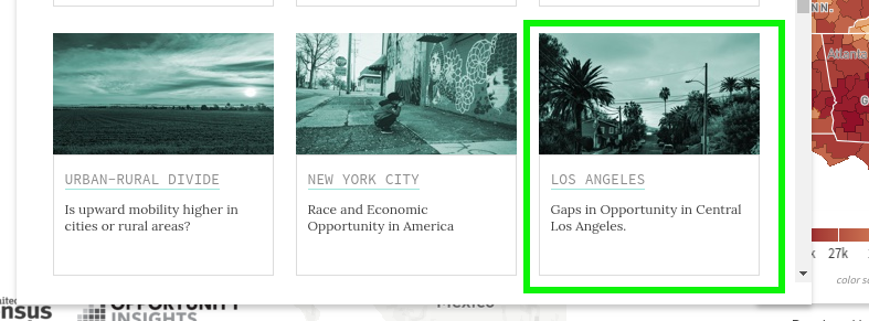
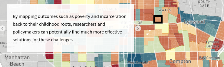
- With The Atlas open, click the hamburger menu >> stories >> Los Angeles
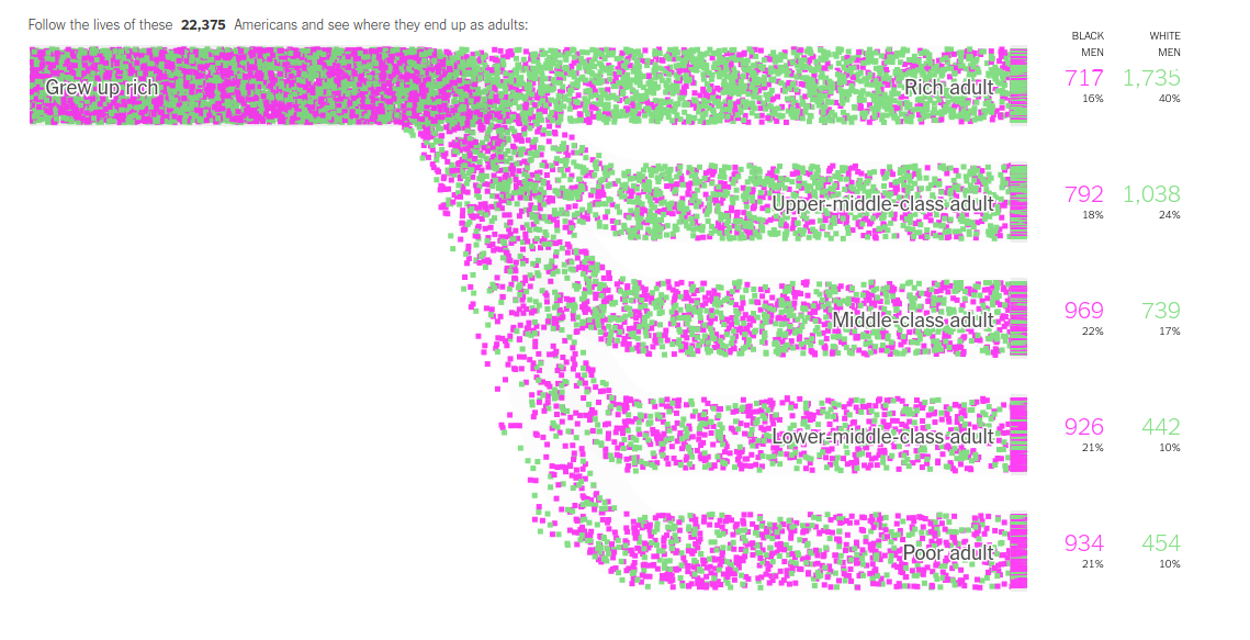
- Click through and study the guided tutorial that compares outcomes of black men in Watts versus Compton.
- Notice the ways in which the tutorial compares various demographic categories across both locations (race and gender) by viewing US Census data related to core social outcomes. This case study compares incarceration rates and income. The Atlas has more than a dozen outcome variables built into its dataset!
Phase 2: Using The Atlas to improve lives
The final little blurb of text in the mini-tutorial makes the following assertion about what The Atlas can help us do:
The natural question becomes: what, exactly, can be done using this data to improve the quality of folks' lives? The Atlas has a nice page describing some specifics from across the country. Devote about 20 minutes to studying The Atlas in Action page.
Phase 3: Find your own example of an opportunity "hot spot"
- Now its your turn to tinker with the tool to find your own example of a location that could be considered an opportunity hot spot--just like Compton is in Las Angeles. Start by choosing a location in the country you have some familiarity with. Zoom in to that location. You'll notice that as you zoom in, the map layers change and eventually give you access to tract-level data in every location in the country.
- Using the hamburger menu, switch into Advanced mode so you can have more control over the data displayed in the map.
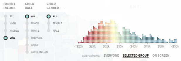
- Choose a parental income range and demographic of interest that's not "all". For example, perhaps you want to focus on white women, or black men. Notice that for some locations, if you choose a demographic category that is only minimally represented in that area, The Atlas will not display estimated values on the map. Don't choose this demographic :)
- Using the process described in the Los Angeles story, tinker with the various parental incomes and corresponding outcome variables, watching as the choropleth colors change to show the variation in the outcomes based on location in your area of interest. We are looking for two locations: one in which the outcomes for your chosen demographic are poor and one in which they are better--within the same region.
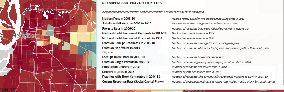
- Once you have found your two areas, we want to try to make some guesses about why the outcomes are so different. Use the Neighborhood Characteristics to gain insight into what's going on in these areas. Is the overall poverty rate different? Is the population density different?
- Once you have identified what you think are interesting characteristics of your two places, dig into the Exercise 2 questions in the student worksheet. Take your time to do some careful analysis!
- Use the button called "download as image" in the lower left of The Atlas to capture the area you've chosen to analyze. Make sure you thoughtfully choose the variables selected in the upper right before taking your screen shot.
A Screen clip of the available neighborhood characteristic variables you can explore to determine reasons for the difference in mobility levels
Phase 4: Upload to your shared drive
Finish your worksheet and the paragraph responses asked for at the end. Upload your screen shots and completed work sheet to your shared drive directory.
Page created in Nov 2018 and can be freely reproduced according to the site's content use agreement.