Index exploration
listContents
Phase 0: Index fundamentals
Phase 1: Exploring about human condition indicies in Gapminder
Phase 2: Bundling indicies for regional comparisons
Mini-project ideas
Visualizing trends
wb_incandescentIndex fundamentals
Creating indicies involves aggregating the values of two or more underlying data measures into a single value, usually scaled for ease of comparison
Key points on Indicies
- Indicies are derived values, meaning they do not directly measure some aspect of the world or people in it; rather, an index attempts to transmit information about a complex system by combining several direct measures in a thoughtful manner.
- We usually think of an index as a unit-less value, since many indicies are meaningful in their use to compare related entities
- Indicies are a "simplification" of a complex system, necessarily leading to a loss of specificity of information in exchange for an increase in clarity of communication
- The underlying composition of an index is worthy of close scrutiny due to the ease by which important patterns in underlying measures can be masked, distorted, or exaggerated
wb_incandescentPhase 1: Exploring about human condition indicies in Gapminder
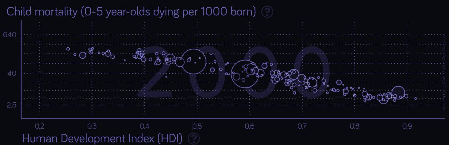
Start by loading the GapMinder browser version with this link. Watch the countries represented by the bubbles reflect changes through time when you click the "run" button in the lower left to begin iterating through years of time-series data.
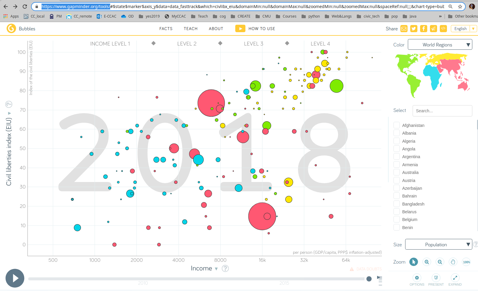
Explore indexes used in GapMinder
On the GapMinder home page, navigate to data. Then use their experimental data explorer to filter all the data sets to only display index fields (leaving out direct measures, such as average age at first child bearing).
Choose an index to explore
table_chart
Shared google doc of index explorations
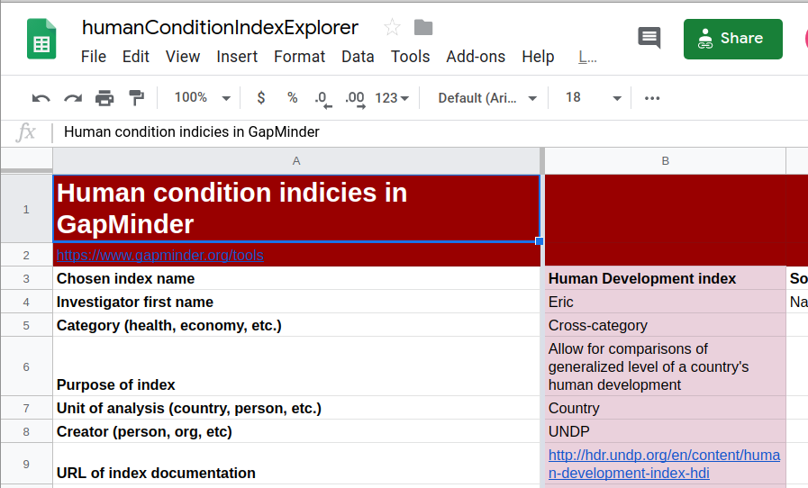
Find an interesting index, click on it and snake your way into the actual source page provided by GapMinder. Locate the documentation on how the index was created and populate this spreadsheet with the results of your exploration.
arrow_upward back up to contents
wb_incandescentPhase 2: Bundling indicies
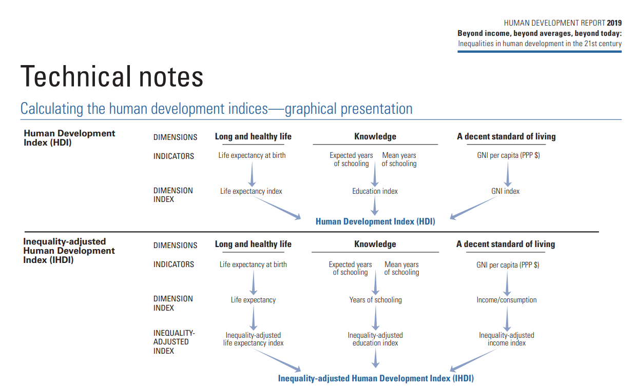
Some well-used indicies are actually meta-indicies in that they are composed of less complex index values which are themselves derived from actual measures of the world.
Study the first few pages of technical notes on the Human Development Index.
menu_book
Human Development Index technical notes (PDF) 
arrow_upward back up to contents
wb_incandescentMini-project ideas
IDEA democracy indicies
Open and explore this treasure trove of data about countries of the world, based on many underlying measures
table_chart
IDEA Democracy index raw data spreadsheet
- Open the above spreadsheet of global development index data
- Copy the spreadsheet into your own google drive: you'll want to be signed in to a google account do this
- Imagine you've been tasked with prioritizing the TOP THREE countries within a chosen region of the world of interest to you to receive international aid from an international organization. Create a visualization using at least two different indexes for 3+ countries in your region. Use the result of these three indexes to rank order your choices.
- Include the results in your dedicated tab in the group index tracking spreadsheet.
table_chart Shared google doc of index explorations
arrow_upward back up to contents
wb_incandescentVisualization
Depicting categorical data over time
The SAT over time
Which time series chart is more effective? Left or right and why?
- Critique the fix-me graphic
- Formatting for chart display: series, ranges, sources
- Comparing countries over time graphically
- Absolute values versus change through time
Fix me!
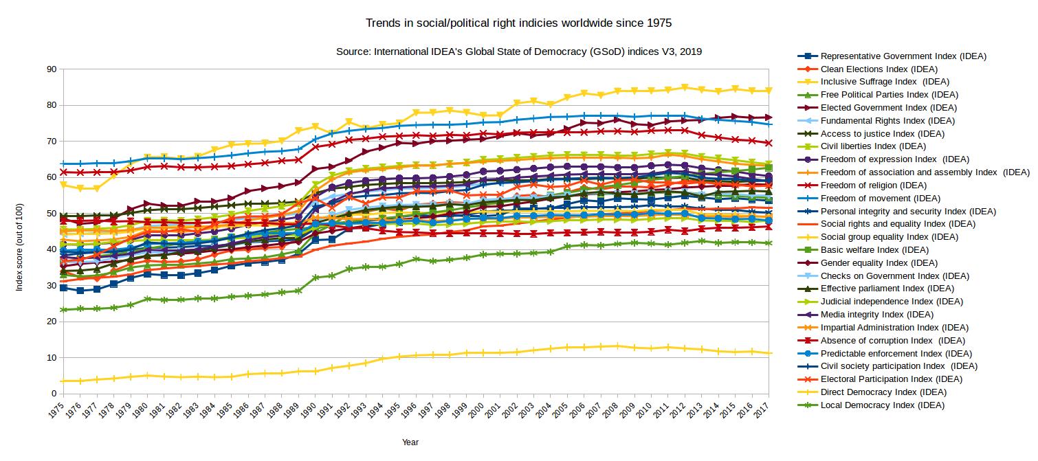
The following visualization of global index data is the first draft of an attempt to illuminate answers to the following inquiry question: How did the world change at the end of the cold war?
Provide the creator of this graphic with a set of suggestions for improving both their overall approach to visualization and create a second draft of the visulization of the world index data for sharing.
arrow_upward back up to contents